


SPRIG (ARIUM)
Book Design/illustration
Sprig(arium) was born as a typographic specimen. The initial intention was to create a functional showcase of the Sprig font family, but since a complete and detailed specimen already existed, the approach shifted toward a freer and more visual exploration. What if, instead of describing letters as design tools, they were observed as living organisms? What if each typographic variation could be imagined as a plant species, with its own way of growing and its own character?
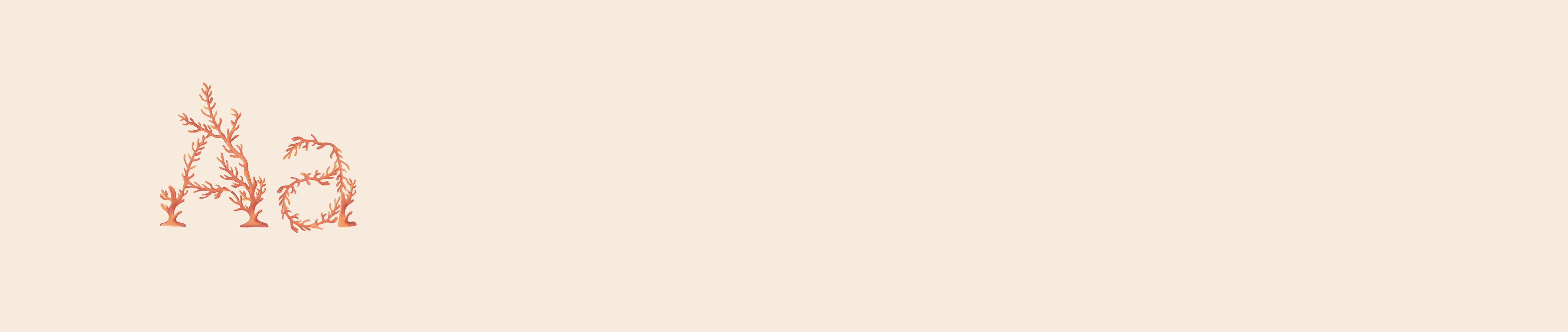
From those questions, this first version of Sprig(arium) emerged: an experimental typographic herbarium. It presents a collection of illustrations where letters and plants intertwine, accompanied by short texts that describe their “habitat,” their visual traits, and a fictional note. The purpose is to present the Sprig font in a different way —sensory, narrative, and speculative— turning the act of showing a typeface into a visual, almost botanical experience that invites us to imagine new ways of seeing and using letters.
Letters, like plants, are born, grow, and transform.
Sprigarium is not a catalog, but a garden:
a place where stems become strokes,
where leaves resemble glyphs,
where typography dares to bloom.


